2026
Weather To
or Not To
STRANGER STATIONS
Weather App
UX Research
AI Prototyping
Prompt Engineering
2024
(TIMELINE)
2 Weeks
This began with a simple brief: design a weather app that does one thing better for one specific person. Instead of trying to make a universal forecast tool, I focused on understanding one peer’s routines, anxieties, and decision-making around weather. Then designed a more personal way for her to interact with their weather app, by helping her decide what to do.
(MYROLE)
Solo: Product designer, UX researcher, Prototyper
(METHODS)
Through interviews, observation, prototyping, and usability testing, i explored how weather information becomes useful only when it connects to someone’s real context: where they go, what they carry, how they commute, and what uncertainty feels like in their day.
(TOOLS)
Google AI Studio, Figma Make
THE RESULT
A weather app where,
Find the best route to move through your day. Avoid getting rained on or a sunburn.
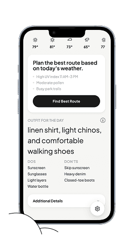
Actionable outfit and activity suggestions based on the weather
Setting notification thresholds for weather conditions that affect you
USER
Research Focus
What parts of a forecast actually shape Emily's daily decisions?
Where do current weather apps fail to support planning, emotion, or context?

For Emily, weather apps aren’t broken. They give her all the information she needs: temperature, rain percentage, humidity, and weekly forecasts.

Before stepping out, she makes a series of decisions:
What should I wear so I’m comfortable all day?
Which route will feel manageable today?
Can I stick to the plan today, or rethink it?
Learnings from the interview
Insight 1: People translate weather into actions
they don’t want raw numbers alone. they want to know what the forecast means for commuting, clothing, social plans, and comfort.
Insight 2: Trust depends on specificity
people trust forecasts more when they understand timing, location, and uncertainty.
Insight 3: Weather affects mood and control
bad or uncertain weather can create anxiety because it disrupts plans.
hover to see the design implications!
The Gap
Weather is one of the most checked pieces
of information daily, but is treated as data to consume rather than context to act on.
people don’t only ask “what’s the temperature?” they ask “can i bike?” “should i bring a jacket?” “will this ruin my plans?” “can i trust this forecast?”
Testing highlighted a tension between the concept and the project's screen-free ethos.
To keep the focus on physical interaction,
we positioned it as a supporting exploration rather than a defining feature.
INITIAL EXPLORATION
The home screen prioritizes immediate decision-making over dense meteorological data. Instead of leading with charts, it gives users a quick read on what the weather means for the next few hours.
Testing highlighted a tension between the concept and the project's screen-free ethos.
To keep the focus on physical interaction,
we positioned it as a supporting exploration rather than a defining feature.
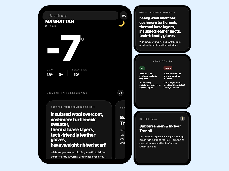
Outfit + Do / Don’t Summary
Instead of scanning hourly charts, Soomin gets a quick, scannable answer to the question: “Am I dressed right for today?”

USER TESTING
What I was testing: Does this actually reduce thinking?
Testing highlighted a tension between the concept and the project's screen-free ethos.
To keep the focus on physical interaction,
we positioned it as a supporting exploration rather than a defining feature.
In early testing, the concept resonated immediately. Emily felt that the app understood the kind of decisions she was trying to make, not just the weather she was trying to check.
But the prototype also revealed a gap between personalized information and usable guidance. The cards contained the information, but still required too much effort to scan, interpret, and act on.

Learnings from user testing
The cards were information-rich, but too dense
Key decisions were not immediately obvious
Emily still had to scan and interpret before knowing what to do
Weather did not just influence her plans – it shaped how she moved through the city
Weather did not just influence her plans – it shaped how she moved through the city
What Changed is that I simplified the cards around faster decision-making: what matters now, what might change soon, and what action she should consider. Instead of making the app feel smarter by showing more information, I made it more useful by reducing the amount of interpretation required.
Testing highlighted a tension between the concept and the project's screen-free ethos.
To keep the focus on physical interaction,
we positioned it as a supporting exploration rather than a defining feature.
Route-Aware Weather
Evaluate routes based on comfort and safety
Assess how weather might impact specific plans
Suggest alternatives that may take longer but feel easier to navigate
Prompt reconsideration when conditions make a plan unnecessarily stressful
Route-Aware Weather
Evaluate routes based on comfort and safety
Assess how weather might impact specific plans
Suggest alternatives that may take longer but feel easier to navigate
Prompt reconsideration when conditions make a plan unnecessarily stressful
Route-Aware Weather
Evaluate routes based on comfort and safety
Assess how weather might impact specific plans
Suggest alternatives that may take longer but feel easier to navigate
Prompt reconsideration when conditions make a plan unnecessarily stressful

REFLECTION
This project taught me that even familiar tools like weather apps carry deeper questions of trust, interpretation,
and emotional reassurance. If I continued the project, I would test how people respond to different levels of forecast uncertainty and whether personalized recommendations increase confidence without making the app feel overbearing.
Testing highlighted a tension between the concept and the project's screen-free ethos.
To keep the focus on physical interaction,
we positioned it as a supporting exploration rather than a defining feature.