2024
LIGHT
PHONE II
STRANGER STATIONS
Mobile OS
WCAG Audit
UI Design
Prototyping
Digital Accessibility
2024

(TIMELINE)
15 Weeks
The Light Phone II's Purpose is to build a minimalist phone for mindful use with essential functions only: calls, texts, alarm, navigation. With a Goal to reduce digital overload but still provide accessibility for all users.
The assumption built into that is that simplicity and accessibility go hand in hand. The WCAG audit told a different story. The same minimalism that cuts distractions also cuts access. Fixed text. No assistive technology support. Touch targets too small to hit reliably. The design challenge was to make the device work for more people.
Read more

The phone’s minimalist design unintentionally creates barriers for low-vision, motor-impaired,
and cognitively diverse users.
(TEAM)

(MYROLE)
Audited the device, narrowed a long list of fixes down to two that wouldn't break what makes Light Phone Light Phone, then designed both under the constraint of a tiny screen that resists complexity.
WCAG 2.1 / 2.2 audit across all four criteria to identify where the device's minimalism was creating unintentional barriers.
Scoped solution space to two system-level features that preserved the device's core philosophy.
Designed UI for Text to Speech, working through constraints of a 2.84" E-ink screen and edge cases like message length, reading speed, volume, and live preview placement.
Tested interaction flows and accessible UI components, validating that the solutions stayed true to Light Phone's goal of minimal screen interaction.
FROM AUDIT TO DECISION
FROM AUDIT TO DECISION
Button Stacking
Button Stacking
Instead of placing buttons side-by-side, we stacked them vertically at full width to increase tap accuracy and create a clearer, more accessible touch target.
Instead of placing buttons side-by-side, we stacked them vertically at full width to increase tap accuracy and create a clearer, more accessible touch target.
Volume Too Low
Your volume is too low to play this message.
Increase Volume
Cancel
Volume Too Low
Your volume is too low to play this message.
Raise Volume
Cancel
Volume Too Low
Your volume is too low to play this message.
Cancel
Raise Volume
Volume Required
Please increase the system volume to hear
the message.
Increase Volume
Instead of adding complexity to the UI, we built two lightweight, system-level accessibility pathways that preserve the device’s minimalist ethos:
1. Scalable UI
Makes the interface flexible and comfortable for all vision and motor needs.
2. Text-to-Speech
Makes core communication accessible even without relying on vision.
Makes core communication accessible even without relying
on vision.
Together, they transform Light Phone into a device that stays simple but becomes radically more inclusive.
Text-to-Speech for Messages
The design introduces a native Text-to-Speech mode, enabling users to:
A native TTS mode reads incoming messages aloud. Adjustable speed, optional auto-read, spoken confirmation states.
The design introduces a native Text-to-Speech mode, enabling users to:
Hear messages read aloudAuto read feature, adjust text-to-speech speed
Receive spoken confirmation of feedback messages (sent, delivered, failed)
The design introduces a native Text-to-Speech mode, enabling users to:
Hear messages read aloudAuto read feature, adjust text-to-speech speed
Receive spoken confirmation of feedback messages (sent, delivered, failed)
The hard part was fitting customization onto a screen that resists it. Every control had to earn
its place.
Two edge cases shaped the final design:
1. A volume warning before silent playback failure, 2. A permission prompt before reading unusually long messages.
Click on the prototype to begin playback.

This feature directly responds to missing WCAG compliance for non-visual access and programmatic status communication.
This feature directly responds to missing WCAG compliance
for non-visual
access and status communication.

Scalable UI

A flexible layer allowing users to adjust:
Users choose from three text size presets with a live preview before saving. The layout reflows to prevent truncation. The preview is inline, attached to the selection, not on a separate screen. On a device designed to minimize screentime, leaving to preview and coming back was the wrong answer.
Scalable UI
A flexible layer allowing users to adjust:
Users choose from three text size presets with a live preview before saving. The layout reflows to prevent truncation. The preview is inline, attached to the selection, not on a separate screen. On a device designed to minimize screentime, leaving to preview and coming back was the wrong answer.

This feature directly solves the audit’s core gap: the interface must adapt to the user, not ask the user to adapt to the device.
FROM AI OUTPUT TO DESIGN DECISION
I used AI to generate initial flow for the 2 features, full interaction specs, edge cases, microcopy, and state logic.


It surfaced things worth keeping: the volume warning before silent playback failure, the long message prompt, and the voice speed options.
It also surfaced things that needed to go: UX copy that didn't sound like Light Phone, interactions designed for a generic smartphone rather than a 2.84" E-ink screen.
It surfaced things worth keeping: the volume warning before silent playback failure, the long message prompt, the voice speed options.
It also surfaced things that needed to go: annotation-heavy layouts, UX copy that didn't sound like Light Phone, interactions designed for a generic smartphone rather than a 2.84" E-ink screen.
It surfaced things worth keeping: the volume warning before silent playback failure, the long message prompt, the voice speed options.
It also surfaced things that needed to go: annotation-heavy layouts, UX copy that didn't sound like Light Phone, interactions designed for a generic smartphone rather than a 2.84" E-ink screen.
3 DECISIONS (EXPLORATION)
IA and Flow
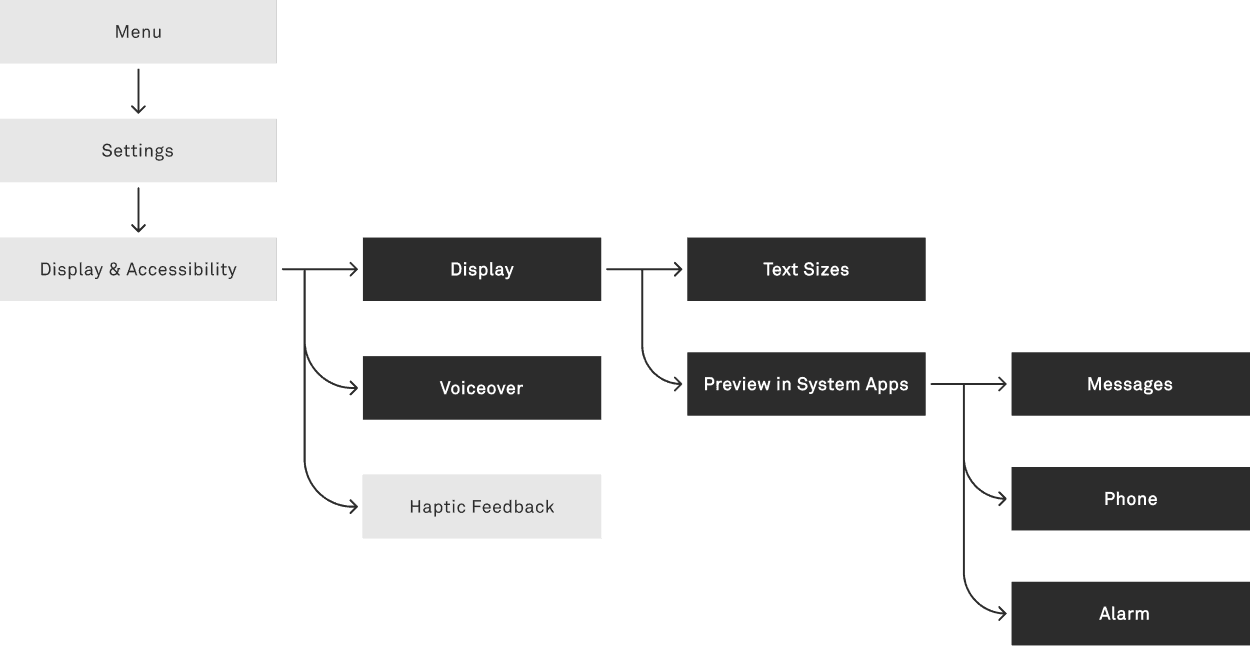
Nested four levels deep in v1. Flattened to two. Any setting, under three taps.
V1
The information architecture is hyper-nested. It increases friction. Users might take longer to find settings, miss key features, and lose context as they move through too many layers.
Phone
Alarm
Directions
Notes
Settings
Settings
Display & Accessibility
Sound
Privacy
About
Display & Accessibility
Display
Contrast
Sleep Timer
Display
Small
Medium
Large
Make your phone’s text and buttons clearer for you.
Large: Preview
Preview in apps
Phone
Alarm
Messages
Sample Text
Check if this size feels easy to read.
Sample
Sample
Large: Preview
Preview in apps
Phone
Alarm
Messages
Sample Text
Check if this size feels easy to read.
Sample
Sample
Save
Mom
2:14 PM
Are you going to the show tonight?
2:16 PM
Yep! On my way
2:20 PM
Hey, I wanted to let you know that the
Finalised Flow
This flow reduces depth and improves wayfinding. Users can reach each setting faster, keep context, and avoid drilling through unnecessary layers.

Phone
Messages
Alarm
Directions
Settings
Settings
Accessibility
Sound
Privacy
About
Accessibility
Text Size
Voiceover
Display
Sleep Timer
Small
Here’s a preview of your text size.
Sample
Sample
Medium
Large
Change the text size to improve readability.
Text Size
Small
Medium
Large
Here’s a preview of your text size.
Sample
Sample
Change the text size to improve readability.
Text Size
Settings
Accessibility
Sound
Privacy
About
Accessibility
Text Size
Voiceover
Display
Sleep Timer
Phone
Messages
Alarm
Directions
Settings
Settings
Accessibility
Sound
Privacy
About
Accessibility
Text Size
Voiceover
Display
Sleep Timer
Small
Here’s a preview of your text size.
Sample
Sample
Medium
Large
Change the text size to improve readability.
Text Size
Small
Medium
Large
Here’s a preview of your text size.
Sample
Sample
Change the text size to improve readability.
Text Size
Settings
Accessibility
Sound
Privacy
About
Accessibility
Text Size
Voiceover
Display
Sleep Timer
Button Stacking
Instead of placing buttons side-by-side, we stacked them vertically at full width to increase tap accuracy and create a clearer, more accessible touch target.
Volume Too Low
Volume Too Low
Your volume is too low to play this message.
Your volume is too low to play this message.
Increase Volume
Increase Volume
Cancel
Cancel
Vertically stacking solved the problem when scaled across all three text presets.
Vertically stacking solved the problem when scaled across all three text presets.
Volume Too Low
Volume Too Low
Your volume is too low to play this message.
Your volume is too low to play this message.
Cancel
Cancel
Raise Volume
Raise Volume
Volume Too Low
Volume Too Low
Your volume is too low to play this message.
Your volume is too low to play this message.
Raise Volume
Raise Volume
Cancel
Cancel
Side-by-side failed the 44px touch target standard and introduced misfire risk.
Side-by-side failed the 44px
touch target standard and
introduced misfire risk.
Volume Required
Volume Required
Please increase the system volume to hear
the message.
Please increase the system volume to hear
the message.
Increase Volume
Increase Volume
Accessible Interface Layout
Preview attached to the selection, not on a separate screen. Tighter feedback loop, fewer taps.

List Layout
We explored ways to highlight the selected option without extra text or clutter, keeping the hierarchy clean and the layout aligned with the Light Phone’s minimal style.
Display
Display
Display
Small
Small
Small
Medium
Medium
Medium
Large
Large
Large
Display
Display
Display
Medium
Medium
Medium
Large
Large
Large
Small
Small
Small
Make your phone’s text and buttons clearer for you.
Make your phone’s text and buttons clearer for you.
Make your phone’s text and buttons clearer for you.
Display
Display
Display
Small
Small
Small
Medium
Medium
Medium
Large
Large
Large
ACCESSIBLE STYLEGUIDE
Before prototyping, we built a unified system to support accessible interactions that are scalable, legible, and intuitive, without compromising the device’s minimalist ethos. This style guide ensures every feature feels native to the device’s distraction-free design.
Type Hierarchy: Designed for Legibility
We created size presets that preserve layout, increase contrast and weight to strengthen hierarchy to support users with low vision, dyslexia, or reading fatigue.

Colour System: High Contrast, Intentional
We kept the original black-and-white E-ink palette, intentionally avoiding colour to preserve the device’s calm, distraction-free experience, while ensuring contrast levels that support users with low vision, dyslexia, or reading fatigue.
#ffffff
#000000
Buttons & Components: Minimal but Inclusive
Examined the core components through an accessibility-first lens, expanding touch targets to meet 44px standards, making buttons clearer, and adding more feedback states. Paired icons with labels for better comprehension. Interactions that remain familiar and minimal, but far more forgiving and inclusive.
button
Button
/
Primary
/
Default
Akkurat
12
/
20
Regular
+0.4
•
|o|
10
|o|
6
Button
Button
/
Secondary
/
Default
Akkurat
12
/
20
Regular
+0.4
•
|o|
10
|o|
6
Button
Button
/
Tertiary
/
Default
Akkurat
12
/
20
Regular
+0.4
•
|o|
10
|o|
6
BUTTON-DEFAULT
button
Button
/
Primary
/
Disabled
Akkurat
12
/
20
Regular
+0.4
•
|o|
10
|o|
6
Button
Button
/
Secondary
/
Disabled
Akkurat
12
/
20
Regular
+0.4
•
|o|
10
|o|
6
Button
Button
/
Tertiary
/
Disabled
Akkurat
12
/
20
Regular
+0.4
•
|o|
10
|o|
6
BUTTON-DISABLED
MINIMAL ICONS
The company’s value is the experience of going light, which is why we believe accessibility is core to our business.
1. Widens potential market
By making it usable for people with low vision, cognitive differences, temporary impairments, and aging users as well
as children.
Increase user adoption
By strengthening brand trust and positioning Light as a device that supports all users, not just tech-minimalists.
3. Reduces CX burden
By creating a more intuitive and self-navigable product.
And this makes the customer experience better because
1. Scalable UI
ensures that users can read, navigate, and interact with the device comfortably in any context, sunlight, aging vision, motion, or temporary impairment.
2. Text-to-Speech
gives users hands-free access to messages and essential information, therefore expanding how and when the device can be used by people.
Together, they make the device more intuitive, more flexible, and more supportive of real-life needs, without compromising it's core minimalist philosophy.